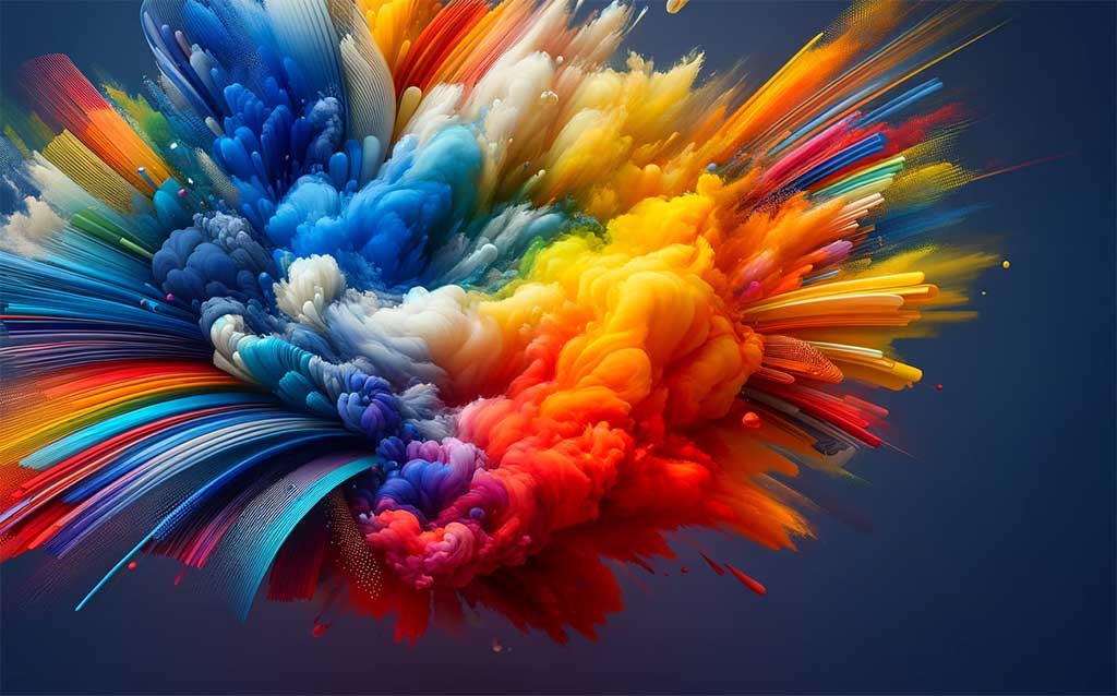
The Impact of Color in Website and Graphic Design
1. Introduction to Color Psychology
Color psychology plays a pivotal role in website and graphic design. It's not just about aesthetics; colors evoke emotions and communicate messages without words. Understanding color psychology can help designers create more engaging and effective designs.
2. Red and Yellow: Energy and Optimism
Red, associated with energy, excitement, and passion, is often used for call-to-action buttons or to draw attention. Yellow, representing optimism and cheerfulness, is great for creating a welcoming and energetic vibe.
3. Blue and Green: Trust and Harmony
Blue, a color that signifies trust and reliability, is widely used in corporate and tech industry designs. Green, symbolizing harmony and growth, is ideal for eco-friendly or wellness brands.
4. Black and White: Elegance and Simplicity
Black and white, a classic combination, exudes elegance, simplicity, and sophistication. It's perfect for luxury brands or minimalist designs.
5. Purple and Pink: Creativity and Femininity
Purple, known for its creativity and luxury, is excellent for beauty or artistic websites. Pink, often associated with femininity and playfulness, works well for youthful and fashionable brands
6. The Value of Contrasting Colors
Contrasting colors, when used strategically, can greatly enhance the visual impact and readability of a design. For example, using dark text on a light background (or vice versa) improves readability and draws the viewer's attention effectively. Contrasting colors can also be used to highlight important elements like call-to-action buttons or key information, making them stand out and enhancing user engagement.
7. Benefits of Using Contrasting Color Combinations
Using contrasting color combinations can bring several benefits to website and graphic design. These include improved readability, better user engagement, and a clearer hierarchy of information. Contrasting colors can also guide the user's eye through the design, helping to create a more intuitive and user-friendly experience.
8. The Importance of Contrast and Accessibility
While choosing colors, it's essential to consider contrast and accessibility. High contrast color combinations, like black on white, ensure readability and accessibility for all users, including those with visual impairments. It's not only a design choice but also a matter of inclusivity and user-friendliness.
9. Conclusion: The Power of Color
The use of color in website and graphic design is a powerful tool. It's about striking the right balance between aesthetics, emotional impact, functionality, and accessibility. By thoughtfully choosing colors, designers can create experiences that are not only visually pleasing but also emotionally resonant and accessible.
Remember, color is not just a design element, but a means of communication in the digital world.
