10 Bad Web Design Things That People Still Do Today
1. Mystery Meat Navigation
Who doesn't love a good mystery? Apparently, web designers who still use obscure icons without labels for navigation. It's like playing "Guess Who?" but with important website pages.
2. Comic Sans Everywhere
Ah, Comic Sans, the font that refuses to retire, popping up in places it has no business being. It's like that one uncle who tries to be cool at family gatherings but just can't pull it off.
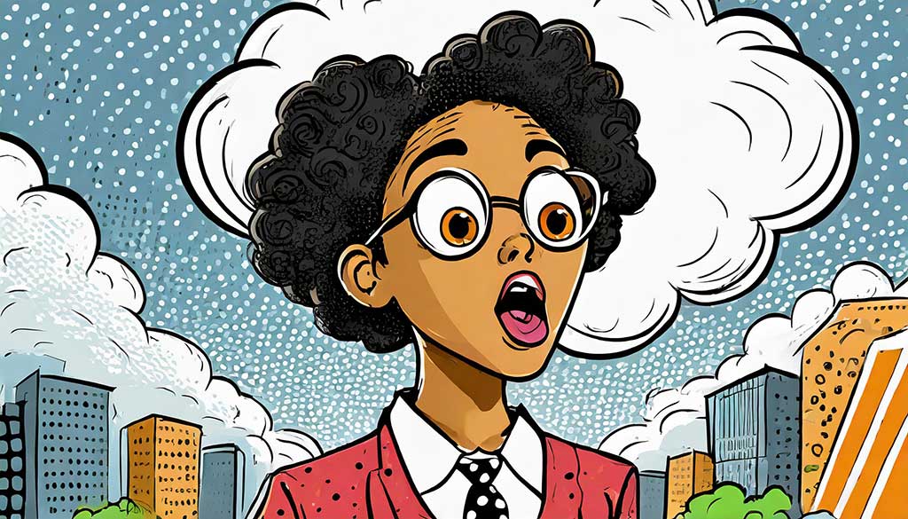
3. Auto-Playing Videos with Sound
Nothing says "Welcome to our website" like being blasted by a surprise video. It's the digital equivalent of a jump scare in horror movies but without the thrill.
4. Pop-Up Palooza
Why have one pop-up when you can have ten? Some sites take this to heart, creating a game of whack-a-mole for users trying to find the close button.
5. Flash Intros
Flash may be as dead as a doornail, but some websites didn’t get the memo. They're like internet fossils, only less educational and more frustrating.
6. Infinite Scrolling Without a Purpose
Ever feel like you're on a treadmill when browsing a website? That's infinite scrolling without an end in sight. It's the digital "Are we there yet?"
7. Text Overload
Some websites believe in "the more, the merrier" when it comes to text. It's like reading War and Peace but without the plot or character development.
8. Non-Responsive Design
In a mobile-first world, some sites still refuse to play nice with phones and tablets. It's like trying to squeeze into jeans you wore ten years ago – it's just not going to work out.
9. Confusing Layouts
Ever feel like you need a map to navigate a website? Some layouts are more confusing than trying to assemble furniture without instructions.
10. Hidden Contact Information
Need to contact the company? Good luck. Some websites hide their contact info better than a spy, turning a simple task into a mission impossible.